project07:P3
In my search for as many performances I could possibly find, I stumbled across a particular special one. Under the direction of Benjamin Zander, the Boston Philharmonic Youth Orcestra does not only give a stunning performance of a complex work (see: La Valse), but I noticed a big screen behind the orchestra with where moving geometric coloured shapes are projected. This projection is a creation by Stephen Malinowski. You can find more information on Stephen here.
Contents
[hide]Stephen Malinowski and the Music Animation Machine
Stephen's Project is called the Music Animation Machine, a framework he has been working on since 1974 (!!). Since the release of YouTube in 2005, he has been able to make quite a name for himself and he has been working fulltime on the research since 2010. The Music Animation Machine can be seen as research into the field of visualizing music. This makes the project very interesting for musicians and non-musicians. Music can be confusing for the untrained ear. While trained musicians will always 'feel' the directions of harmony - tension and relief, the fundamentals of western music - and are happily surprised by any unexpected twists and turns, the untrained ear might find all this information confusing. This may explain why in the last 10 or so decades, the complexity of music has seen a drastic step backwards, to appeal to the bigger market. Stephen's work may help this audience understand not only more complex works of classical music by giving them a visual aid of what is to come, but also find the intricacies and finer details one may find in classical music. As his research is vast and comprehensive (and somewhat behind the scope of my original research), below you may find a list of papers which I used to expand upon the research of Stephen Malinowski.
Visualizing Harmony
While reading a written score of music can reveal any crucial piece of information of the music for trained musicians, untrained musicians may become non the wiser. However with recent advances in computing power, we can process MIDI information in totally new ways. For example, the piano roll notation system displayed in Synthesia, where every note falls towards a keyboard so timing and pitch can be observed instantly, revealing many patterns otherwise unnoticed. The software has become popular among young piano students who now don't have the need to learn to read any form of classical music notation.
However, new iterations have emerged with the works of Stephen Malinowski. Most notably: his use of color. Color may prove to be the most intuitive way to provide visual aid in an otherwise completely auditory form of art. Stephen Malinowski has used colors in many different ways: separated by instrument, voice and pitch. The latter is most important to my research. We can generate color codes according to HSL (Hue, Saturatin and Lumination) and shift hue to match with pitch. However, this may not provide any information corresponding changes in harmony, so Stephen used a shift in hue to correspond with the circle of fifths, the deepest fundamental layer of western music. You can read how he achieved this here. Now, the hue value of each note displays it's position in the circle of fifths. If we process the entire piece of music with the same logic, we can find harmonic changes throughout the piece - this information is absolutely essential and the algorithm provides a simple method of providing fundamental information about the piece of music.
Visualization of Harmony in Music with Colour
However, a paper by B. Klemenc and colleagues suggests we can improve upon this by placing each notes in a broader context. Simply put: by averaging pitch between clusters of notes, the given saturation to each note is slightly averaged. By calculating distance between the pitch of the note and it's surrounding notes we get the interval. Any interval can be very stable, unstable or anywhere in between. This is again proved by the circle of fifths. A C and a G have a very stable relation so they are very closeby one another, however a C and an F-sharp have the most unstable relationship, so they are opposite one another in the circle. The distance to the circle is mapped by saturation. By averaging a C and a G we get a value close by the circle, meaning a saturation of (almost) 1.0, by averaging a C and an F#, we end up in the middle of the circle, resulting in a saturatin of (exactly) 0 - so grey. In short, expected intervals have a bright and shiny color, more unstable relationships like chromatic scales or jazz chords are greyish.
Harmonic Visualizations of Tonal Music
A paper by C.S. Sapp notes the problem of finding harmonic centers with digitally notated music. While algorithms may make educated guesses, they are often wrong, as the 'human intervention' of the composer will almost certainly play a big role in the composition of a piece. Therefore Sapp suggests to apply a key finding algorithm through all scales of the piece. Starting with analyzing all notes at once, followed by the first and last half, first middle and last thirds, etcetera, until all notes individually are analyzed. The result is a diagram where the highest probability is almost certainly correct.
Proof of Concept 1.
Mozart - KV265 (1778)
listen here!
Please note the simplicity. One change of tonal centre. Typical 18th century modesty. Variations in C.
Beethoven - Symphony #7, mvt. 2 - Allegretto (1812)
listen here!
Slightly more complex harmonic structure, yet only two minor shifts in key centre. Early romantic simplicity.
Liszt - Concert etude #3 - "Un Sospiro" (1845–49)
listen here!
Innovative changes of tonal centre throughout entire piece. Unexpected changes in color, yet tasteful and pleasent to the ears.
Prokofiev - Toccata in D minor (1912)
listen here!
Extreme chromaticism. Ambiguity, dissonance. Grey. Unclear tonal centre throughout.
Ravel - La Valse (1920)
listen here!
Complex harmonic structure. Distant intervals. Yet rarely dissonant. Colorful, but hard to follow.
Proof of Concept 2.
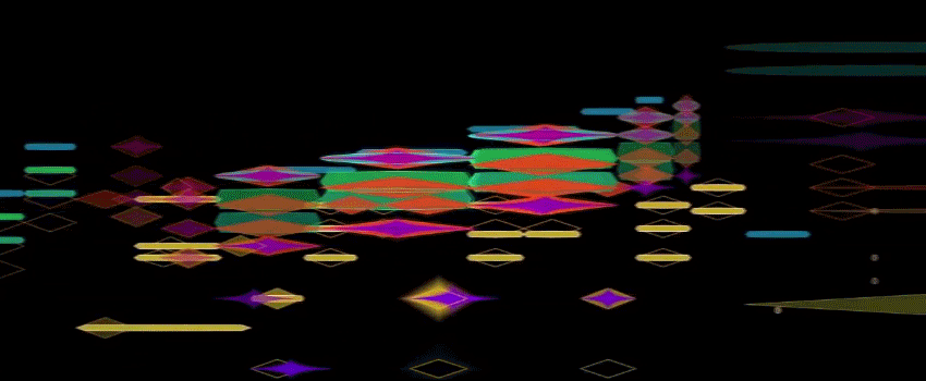
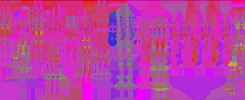
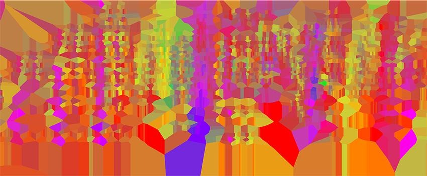
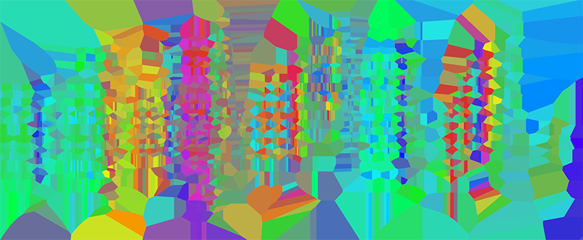
Visualization of La Valse in Rhino/Grasshopper
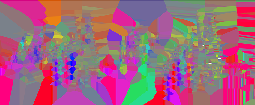
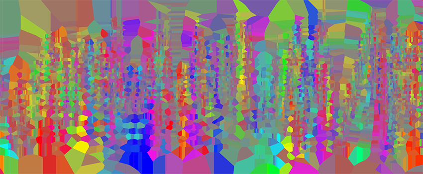
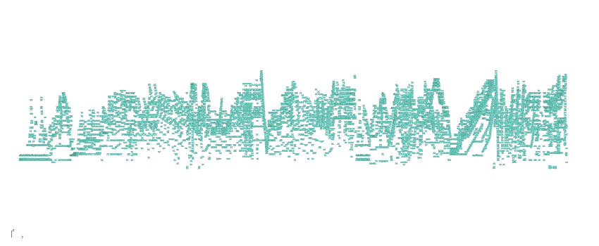 We can use the papers of Klemenc et al. and Sapp to design an algorithm in Rhino/Grasshopper to analyze music in MIDI format. After inputting a MIDI recording of La Valse into grasshopper, we can run an algorithm to first display all notes in ZY frame, Z corresponding with pitch, Y corresponding with time. First we calculate the distance from each notes to it's surrounding (the amount is arbitrary, I used around 10 notes per note) to calculate the interval to all of it's neighboring notes.
list of papers
http://lovro.lpt.fri.uni-lj.si/papers/vhc.pdf
https://ccrma.stanford.edu/~craig/papers/01/icmc01-tonal.pdf